

Here is the magazine spread I chose to analyze. It really jumped out at me as being a great example of the design principles we are studying. It’s an article about the insanely talented musician Tori Kelly, who I’m a fan of. I’m not too familiar with her work, but from what I have heard, she’s an absolute vocal powerhouse. I think the way this article is presented does her justice.
Leading lines
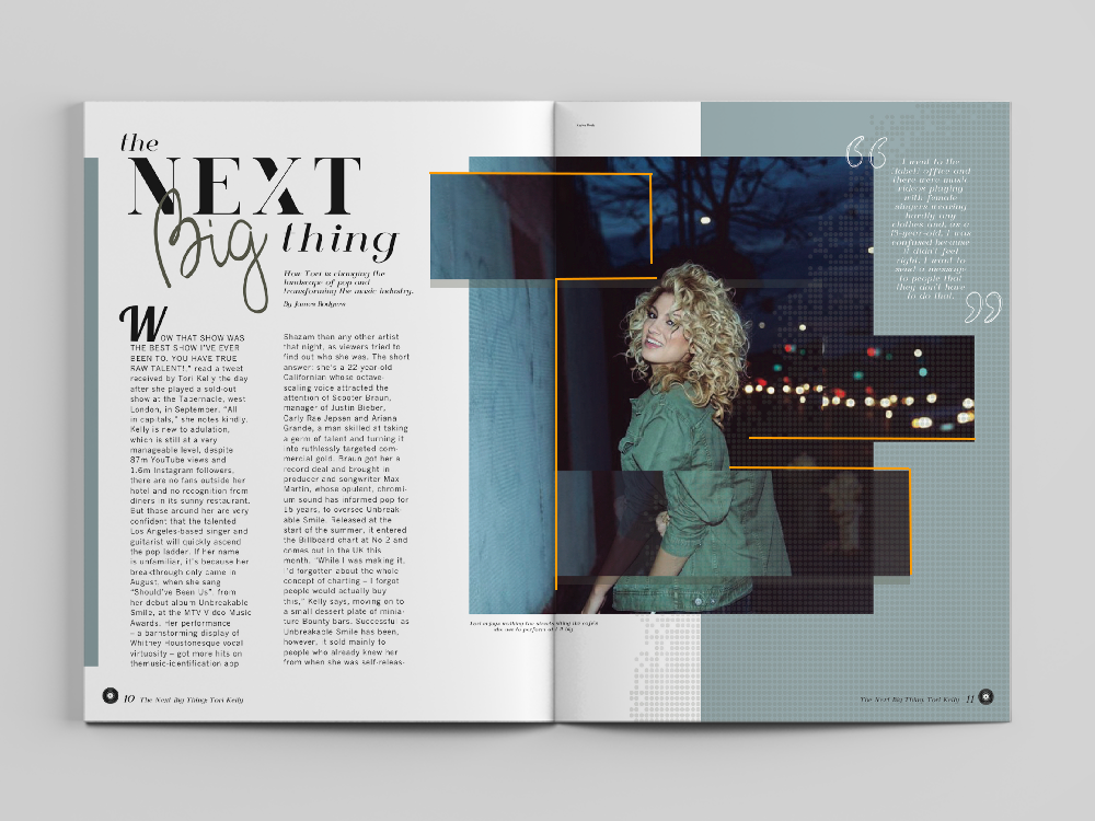
This image has a great example of leading lines because the way the photo itself is edited highlights the lines that are already present in the photo, making them stronger, and using them to draw a more clear emphasis on Tori, the focus of the article and the photo.
The wall already creates a leading line of sorts, as does the horizon line, but by moving parts of the image around, the editor emphasizes these lines, and uses them to point back to Tori. Now, the wall is connected to another leading line that leads to Tori’s face, so is the horizon line.
There’s also definetley elements of depth of field. The blur in the background makes the focus on the image, Tori herself, and the lines leading to her are also helped by the blur in the background.
I’d also argue there’s some clear implementation of the rule of thirds! The picture is divided into three categories; the wall, Tori herself, and the blurred background section where nothing is in focus.
Typeface categories

I’ve highlighted in yellow the two typefaces I’m going to be talking about.
The title features a number of typefaces, but to me the most interesting are the ones used on the words “Next” and “Big”, I would argue they could both be categorized as decorative. (Though “Big” could also be categorized as script, which is why I’m focusing on the typeface they used for the word “Next”)
On the other hand, the typeface for the actual meat of the text is almost undeniably sans serif. These typefaces work really well together, for reasons we’ll take about in a second.
Typefaces- what makes them contrast?
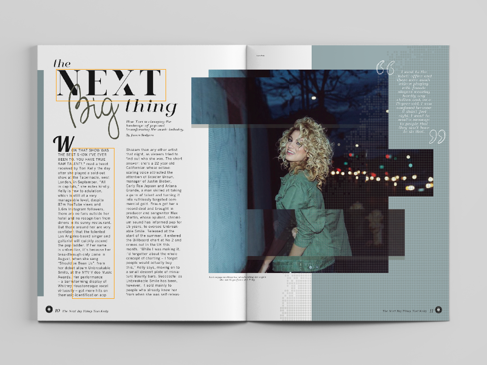
I’ve inserted the image with the highlighted typefaces again so we could analyze something else about them- how they contrast each other.
I think the really bold choices of the typeface for the title really help sell the theme of the piece, and make the more simplistic body text work. The whole page is so artistic, that simple body text may have felt weird were it not for the title text also being so artistic.
More specifically, the body text’s lack of serifs juxtaposes really heavily against the title text’s extreme emphasis on serifs. They feel like they belong together, but are different enough that they draw attention to one another.
Photos that I took to replicate the image
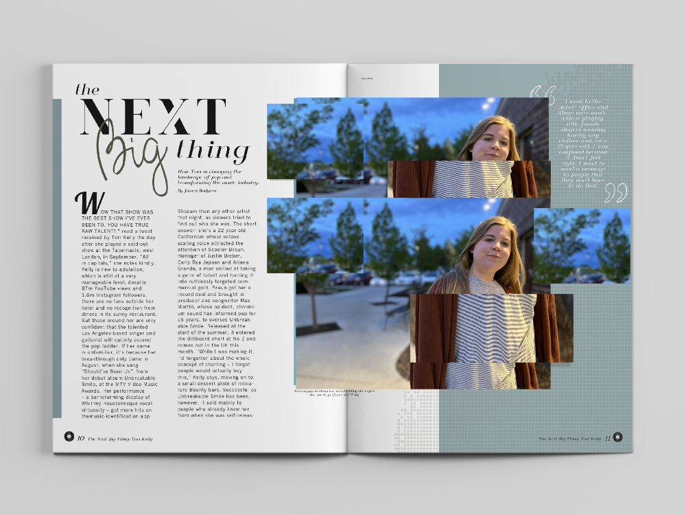
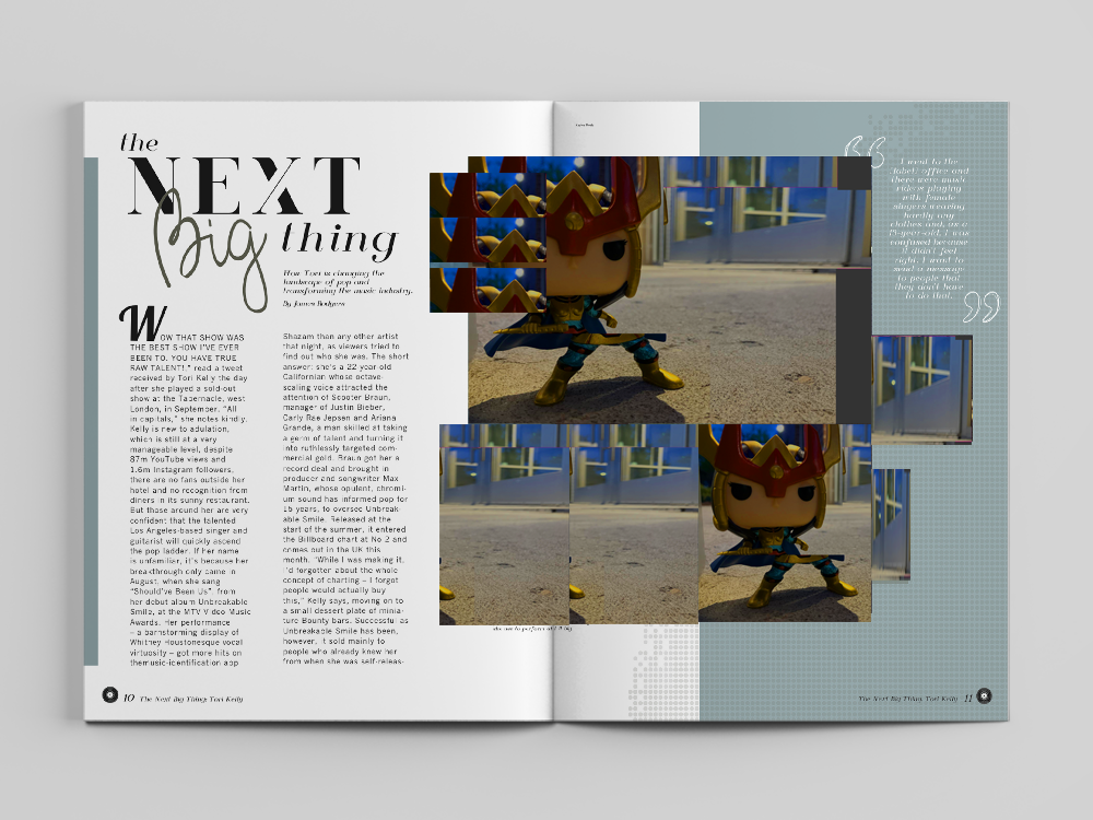

my main focus in trying to recreate the vibe of the image was to focus on placement. Where is the focus in the image? How are horizon lines and other lines lining up with the focus? How can I use the editing styles used in the piece to draw the eye to the focuses of each picture.
I feel I was relatively successful.
Conclusion
Well, I got curious and guess who’s a Tori Kelly stan now? Turns out I love her stuff. I haven’t listened to a ton of it, but so far my favorite from her is “young gun”, her music is so atmospheric and vocally interesting, and musically riveting, and it’s really for me. In other words, this magazine spread really did it’s job! It totally made me want to check out Tori Kelly’s music and she gained a new fan from it.
I think it’s largely the presentation of the photography and the typefaces that make the spread work so well! Everything we’ve talked about makes the spread look so artistic, which really attracts the right audience for Tori’s atmospheric, semi-experimental, but generally mainstream sounding, music. She manages to make music using mainstream sounds but by applying those sounds in more unique ways, and this spread communicates that before you even hear her sing a note.

Leave a comment